
Responsive Website Design • June 2021
Academic Project • UX Academy at Designlab
Mirror: Designing Confidence Into Affordable Fashion
Mirror is a global fashion retailer with 400+ stores selling affordable clothing to budget-conscious shoppers across London, Brazil, and the US. The retailer operates offline-to-online (O2O) transition model and sees itself as a one-stop shop for families who need quality basics without the premium markup.
The project scope: Design a responsive website that centers on a single, concrete objective - make shopping faster and more confident for a time-constrained, price-aware audience ages 19-60.
UI/UX Designer - ideation, research, prototyping
Role
Team
Independent project with weekly mentor feedback and peer group critique
Tools
Paper + Pen, Figma, Miro, OptimalSort, Zeplin
Timeline
1 month
01
Five interviews revealed a consistent pattern: e-commerce friction concentrates around three decision points.
The Challenge
Users navigate category systems where the same item appears in multiple sections (e.g., a cardigan under "Tops," "Layering," "Cardigans," and "Bestsellers"). They either assume the site is disorganized or waste time checking whether they've found the same product twice. Neither outcome leads to purchase confidence.
Cognitive overload at discovery.
When size guides are missing, shipping costs are ambiguous, or return processes feel opaque, users link unclear information directly to brand trustworthiness.
Interview 1: "When I can't immediately resolve a concern, I just leave."
Distrust at critical moments.
Pop-up overlays, forced account creation, unexpected "add-on" sales, and disabled back-button navigation collectively create enough resistance that users abandon cart and step away. A 60-year-old frequent shopper explicitly stated he refuses to engage with sites featuring "add-on" messages after checkout.
Friction compounding into abandonment.
02
Mirror is a fictional e-commerce website that was built around a single principle: enable rapid, confident decisions. Products live in one primary category per item (e.g., "Women's Clothing" → "Tops" → specific item). Secondary tags and filters handle edge cases without creating duplicate listings.The solution was architected around a single design principle: remove every element that doesn't reduce friction or build confidence.
Information Architecture:
Single-category assignment. Each product lives in one primary category (e.g., "Women's Clothing" → "Tops" → specific item).
Transparent navigation hierarchy. Global header shows main categories; category pages reveal subcategories and active filters simultaneously. A persistent left-side filter panel updates product grid in real-time so users see the impact of their choices before clicking. No hidden navigation - all primary paths visible within two clicks.
Persistent context. Clear section headers ensure users always know where they are. Enabled/disabled hover states for category navigation signal current location unambiguously.
The Approach


03
Based on five user interviews, with individuals aged 20-40 across the globe, three themes emerged:
Research & Insights
Users associated clean, simple interfaces with brands that respected their time. Conversely, cluttered sites signaled the business was more interested in maximizing engagement than serving the customers.
Minimalism as trust
When the same item appears in multiple categories, users either (1) assume the site is disorganized or (2) waste time checking whether they’ve found the “same things twice.” Neither outcome leads to a purchase.
Categorization must be unambiguous
When side guides were clear, shipping costs were explicit, and checkout didn’t demand unexpected account creation, users completed purchases. When details were hidden, conversion stalled.
Transparency at decision points matters
04

User Persona
Alex, 28, is a Visual Merchandiser in London who is tech-savvy and stays connected online. But when it comes to shopping, the experience often feels more frustrating than convenient. Cluttered layouts and disorganized product pages make it difficult to find what’s relevant, and she’ll often abandon her cart rather than keep searching.
After enough frustrating experiences, Alex has become more cautious about shopping online. She doesn’t want more products or more recommendations - she wants better ones. She looks for reassurance from other shoppers before deciding what is worth purchasing.
Goal: Find clothes that fit, look good, and feel like a solid value without wasting time or money on returns.
Need: A system that learns her preferences and body type quickly so she can skip the noise and get to things worth purchasing.
Frustration: Guessing on fit online and then managing returns (time + shipping cost).
05
Alex’s pain points reframed into design opportunities:
Problem Statements
Pain Point: Guessing on fit, managing returns.
Design Opportunity: Surface fit signals directly in product discovery - show users how the item actually sits on different body types through verified reviews.
Fit Confidence Through Peer Data
Pain Point: Scrolling through hundreds of options, shopping feels like research.
Design Opportunity: Use category, price, and preference signals to show a curated starting point rather than a firehose. Make browsing feel like a discovery, not work.
Reduce Decision Friction with Defaults
Pain Point: Return process looks painful; shipping costs bite.
Design Opportunity: Design the return process to be frictionless so it no longer blocks the purchase decision.
Make Returns Visible in the UX Design
06
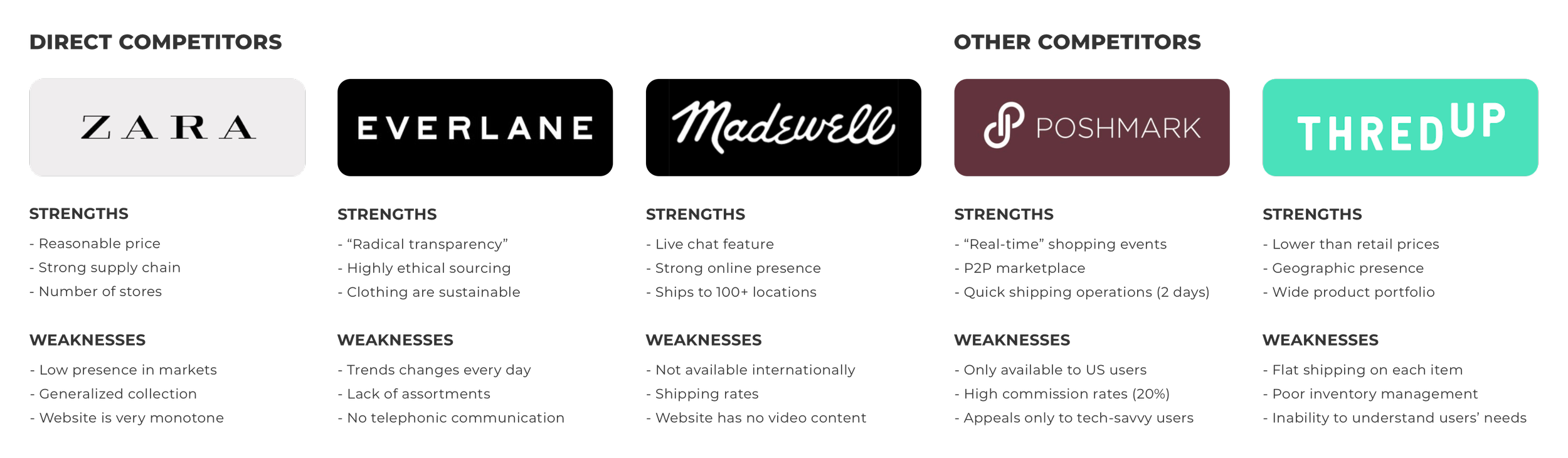
When conducting the competitive landscape, I saw an opportunity: None of the major competitors had invested in clarity as a differentiator. They’d all built for discovery and upsell. Mirror could build for decision confidence.
Competitive Landscape
07
Design System
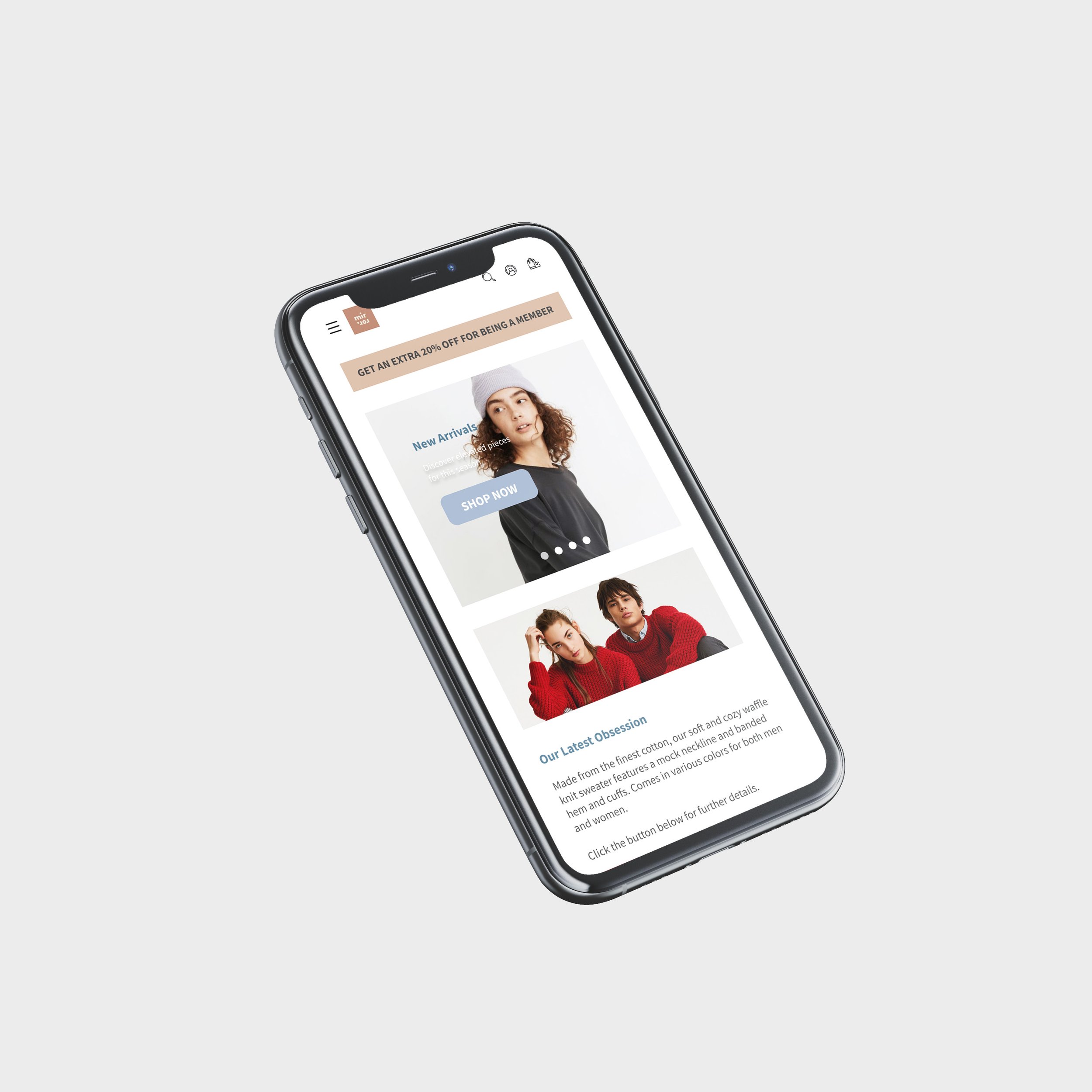
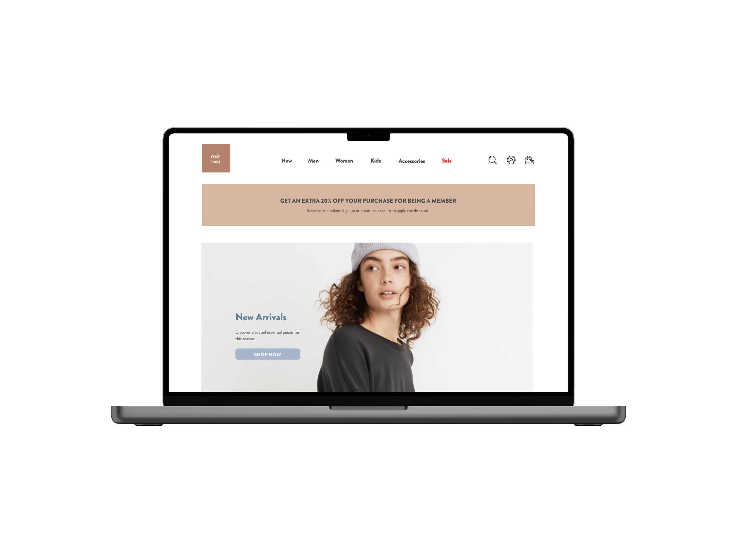
The design system was built around a single principle: enable rapid, confident decisions.
Typography: Neutral sans-serif. Generous whitespace. Clear hierarchy using size and weight.
Color: Minimal palette. Neutral backgrounds. No visual noise.
Components:
Filter panel: Persistent, real-time updates, always visible.
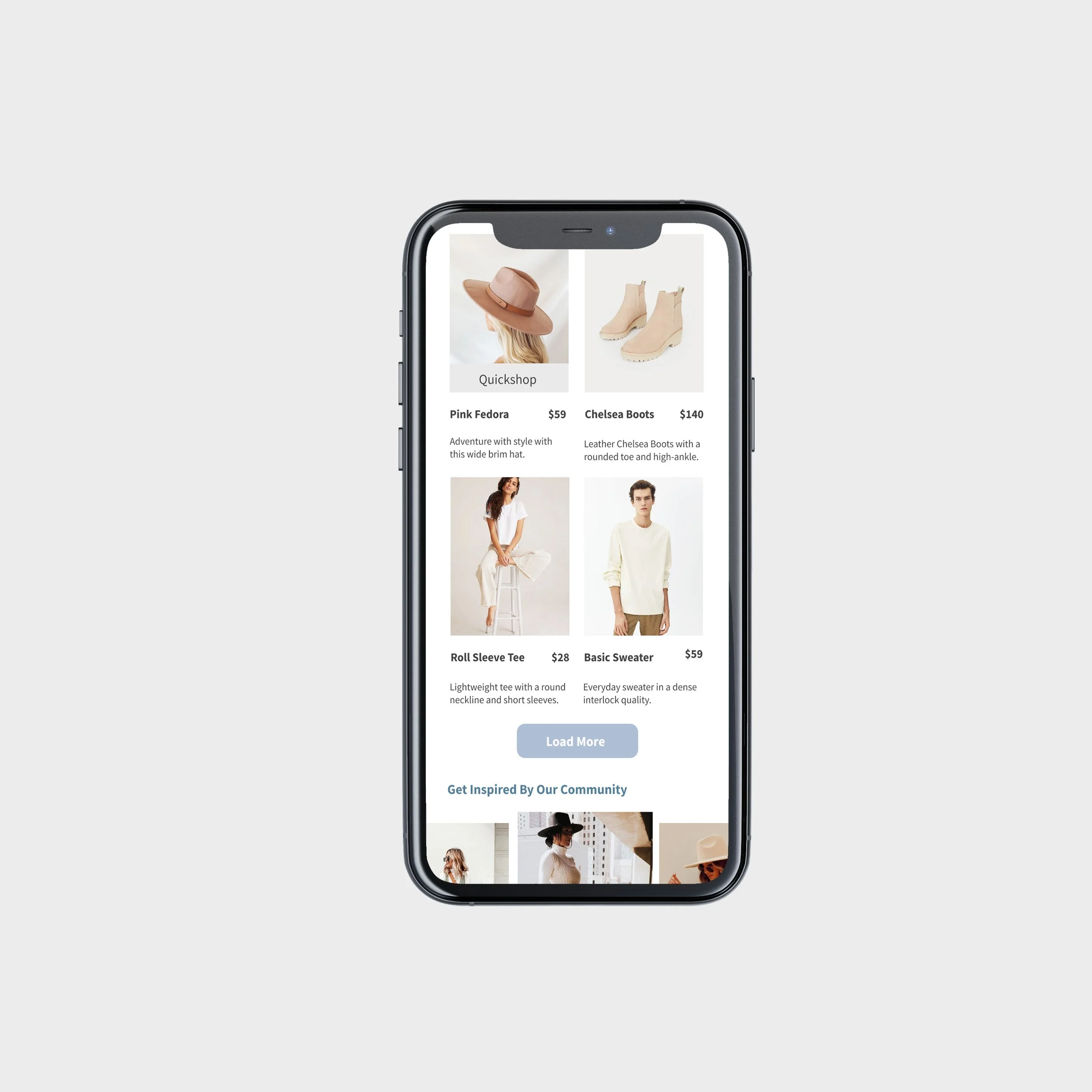
Product grid: 2-4 columns depending on screen size; each card shows image, name, and price.
Forms: Single-column layout; clear input states; no auto-validation errors.
Hierarchy:
Homepage: Featured collections, new arrivals, bestsellers, clear primary CTA (shop by category)
Category pages: Visible filters first, grid of products with essential details (name, price), clear sorting options (bestsellers, price low-to-high/high-to-low)
Product detail pages: Primary image gallery at top, color/size options below, customer reviews with photos, then secondary info (fabric care, sizing guide, fit details).
08
Final Prototype
09
Key Takeaways
Constraints are better design drivers than features.
I came in assuming the product would need lots of features. Instead, I designed backward from friction points. Removing pop-ups was more valuable than adding personalization algorithms. The constraint of single-category assignment forced cleaner information architecture. Limitations pushed toward clarity.
Research framing matters more than participant count.
When I asked, "What features would you want?" I got feature-list responses. When I asked, "What frustrated you last time?" I got raw, actionable insights about distrust and decision paralysis. Five people answering the right questions beat fifty people answering the wrong ones. The quality of the question determines the quality of the direction.
Micro-decisions aggregate into macro trust.
I learned to track the cumulative effect of small interactions. Removing one pop-up doesn't move the needle. But removing pop-ups + enabling back-button navigation + showing clear return policy + displaying reviews with photos = a coherent brand narrative that screams "we respect your time." Each decision alone is tactical. Together, they're strategic.