
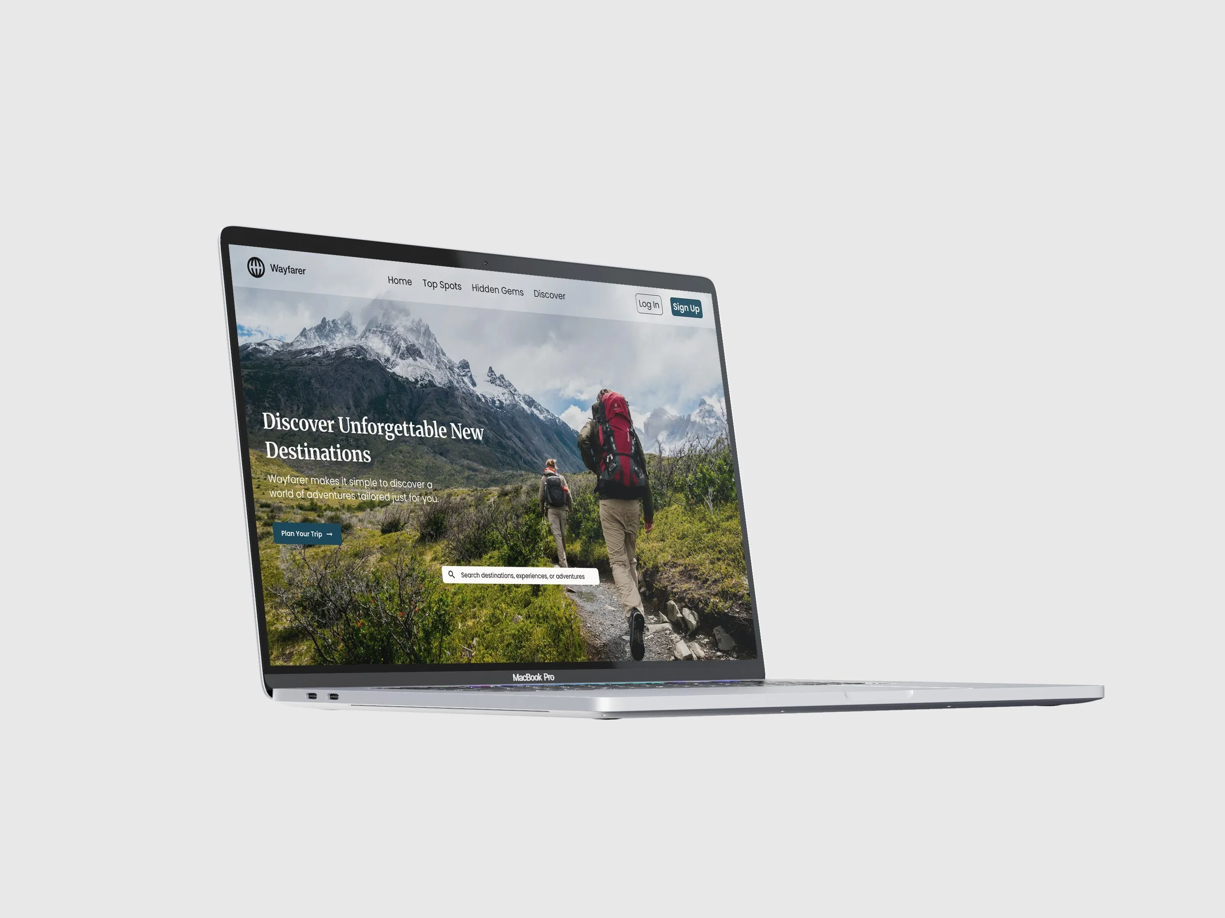
Travel Destination Homepage Design • June 2026
Academic Project • UX Academy Foundations at DesignLab
Wayfarer Travel Destination Website
What if planning your next adventure felt less like scrolling through endless options and more like discovering a place made just for you?
Wayfarer is a modern travel platform concept designed to turn curiosity into exploration. By blending inspiring visuals, thoughtful curation, and an intuitive browsing experience, Wayfarer helps travelers uncover new destinations, dream about what’s possible, and confidently take the first step toward their next journey.
Overview
UI Design • Responsive Design • Interaction Design • Visual Hierarchy • Wireframing
Skills
Tools
Figma, Photoshop
Role
UI/UX Designer
Timeline
1 month
While booking travel is easier than ever, deciding where to go and planning a trip can still feel overwhelming. Travelers often navigate multiple websites and platforms before feeling confident enough to book, leading to decision fatigue. To address this, I designed Wayfarer's homepage to inspire exploration through clear visual hierarchy, intuitive navigation, and engaging content - helping users discover destinations with confidence rather than overwhelm.
The Challenge
Design Direction
Wayfarer's visual identity captures the feeling of discovering somewhere new. A calming blue palette, warm neutrals, and thoughtful typography create a modern, approachable experience designed to guide users from inspiration to action.
Adventurous • Welcoming • Inspiring
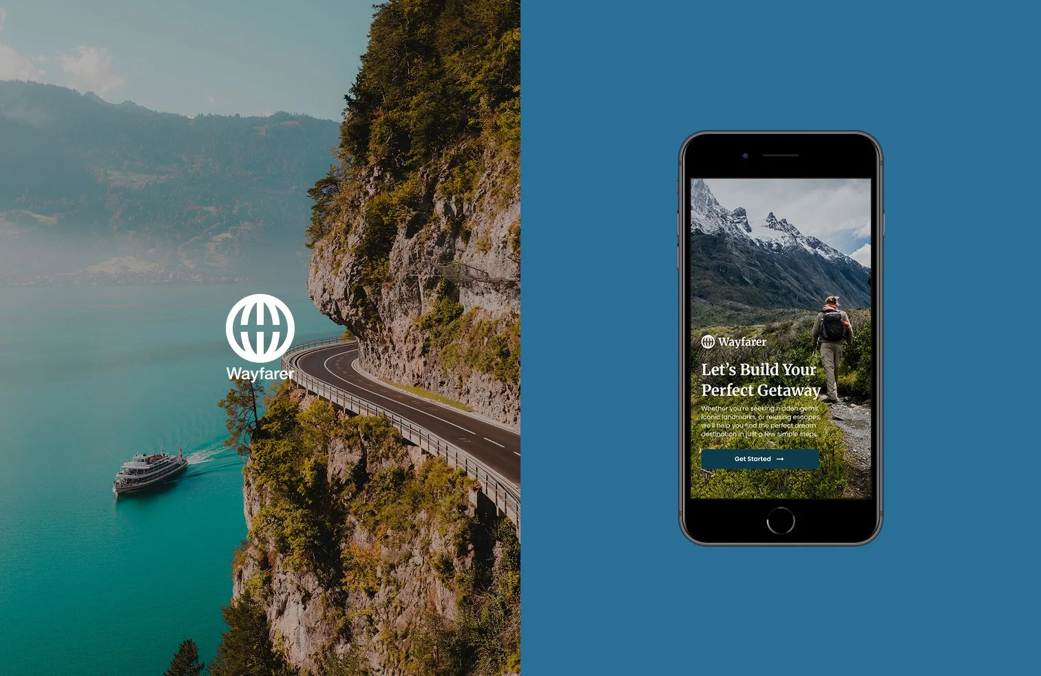
Mobile (Splash Screen)
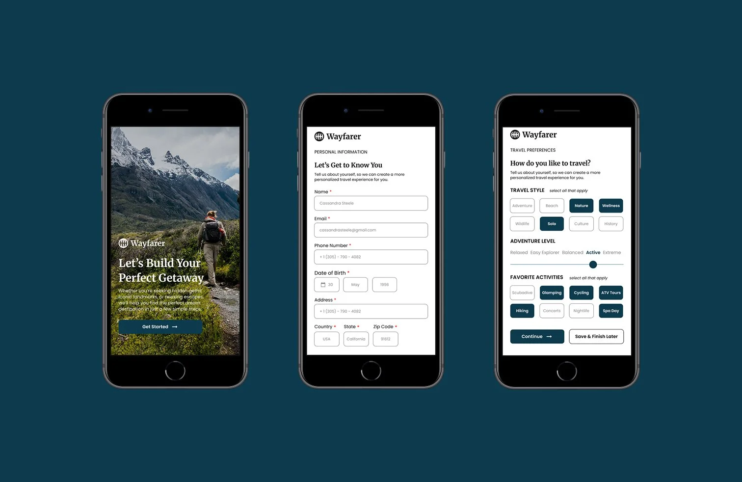
Mobile (Sign Up)
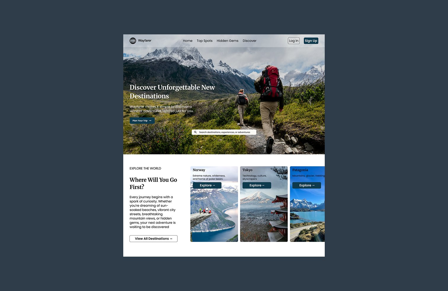
Homepage
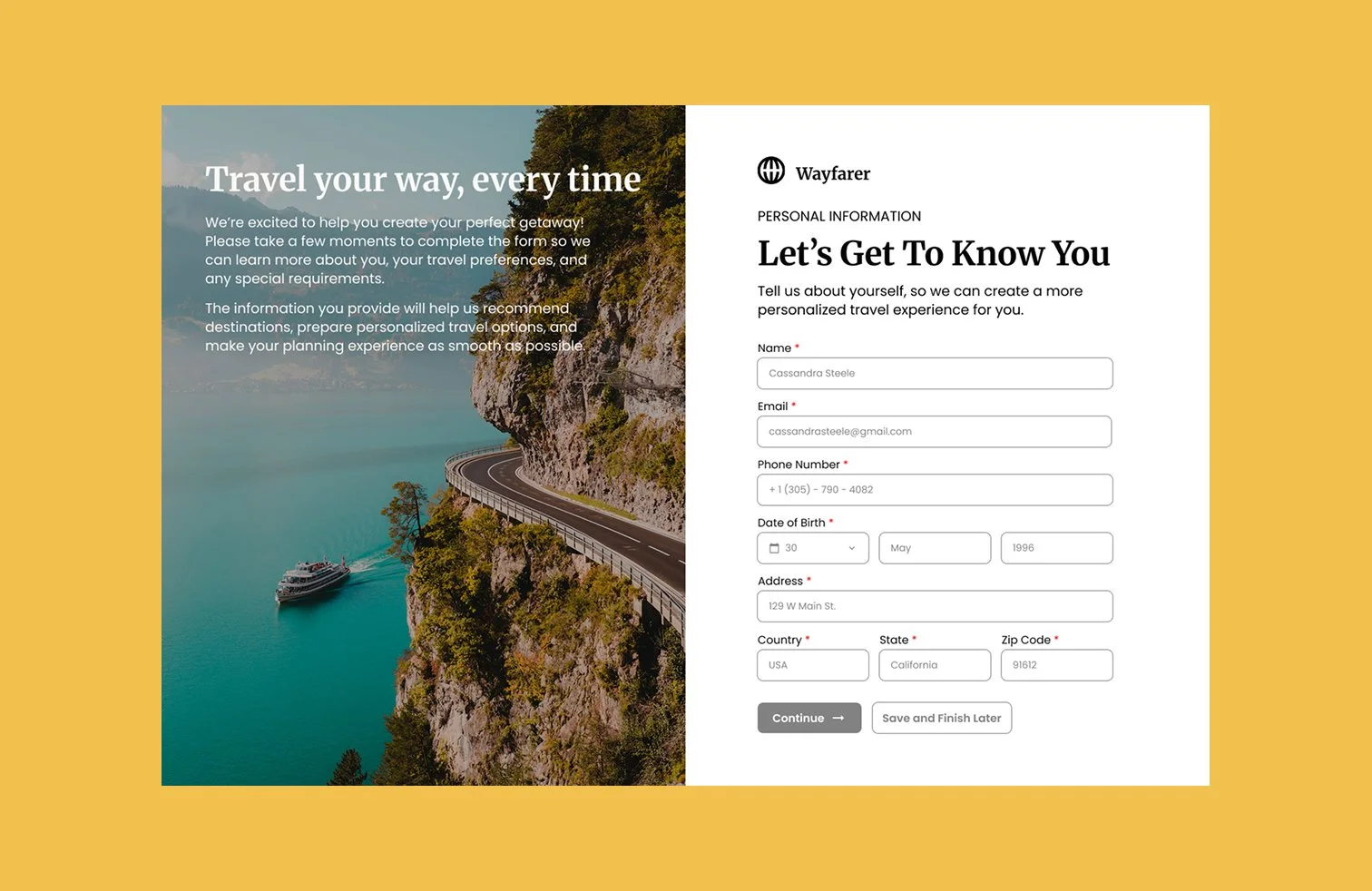
Desktop (Sign Up)
Takeaways
This project strengthened my ability to translate an abstract design brief into a polished interface with a clear user experience. Working from concept through high-fidelity designs reinforced the importance of designing every element with purpose - not only for aesthetics, but also for usability and clarity.
Designing With Intent
Creating a reusable grid system, component library, and consistent visual language improved both the scalability and maintainability of the design. It also deepened my understanding of how thoughtful design systems contribute to more efficient product development.
Building for Consistency
The next phase would focus on usability testing with prospective travelers to evaluate whether users can quickly discover destinations, navigate the homepage, and identify primary calls to action. Testing would help answer an important question: “Can users easily find inspiration for their next trip?”
Validate through User Testing